I'm a little puzzled why the BOM doesn't come out and simply put these graphs more prominently on its website:

Here's the Bureau's explanation of the above graph:
Both adjusted and unadjusted temperatures show that Australia's climate has warmed. Since 1955 adjusted and unadjusted data are virtually identical. It is during this time that most of the warming has occurred in Australia.
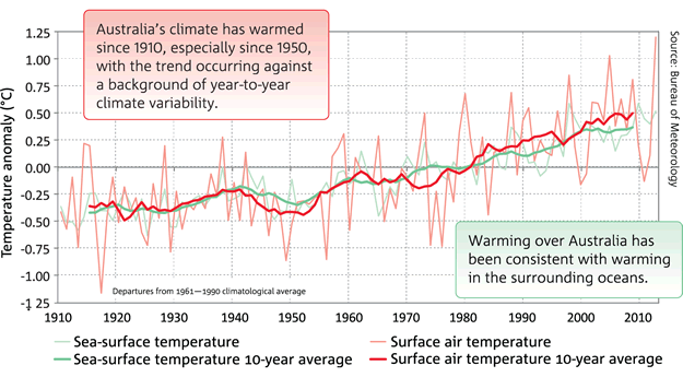
The graph below shows temperature trends since 1910 from the unadjusted temperatures (AWAP), together with those that have been carefully curated, quality controlled and corrected for artificially induced biases (ACORN-SAT). Carefully curating and correcting records is global best practice for analysing temperature data.And the ocean temperature record around Australia follows a similar pattern:
Again, why has the Right become so insistently dumb and gullible on matters of science?


